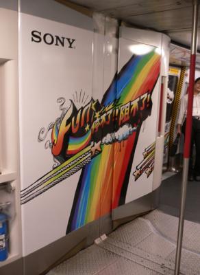
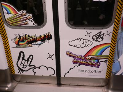
I saw a new Sony ad campaign today on the MTR (the subway in H.K.). It features a free-hand drawing style that is currently popular with certain Japanese clothing designers. It’s sort of an anti computer-perfect look. It’s more like doodles than graffiti, and it’s meant to be youthful and fun. Of course, I’d prefer to see the trains with graff ads, but it did catch my eye.


